

The perfect bedroom is more than just a place to sleep; it's a personal sanctuary, a retreat from the world. The foundation of this retreat begins with colour. The right shade on your walls can transform the mood, enhance the quality of your rest, and serve as a canvas for your personal style. In New Zealand, where we are deeply connected to our dramatic natural landscapes, choosing a paint colour that resonates with this connection can elevate a room from simple to sublime.
This guide moves beyond fleeting trends to explore a curated selection of sophisticated and timeless bedroom paint colour ideas tailored for luxury interiors. We will delve into specific palettes that create an atmosphere of calm, comfort, and refined elegance. You will learn how each colour can be used to craft a space that is both restorative and exquisitely designed.
We'll focus on actionable insights, showcasing how these enduring hues harmonise beautifully with high-quality materials, such as premium European linen and Supima® cotton, to create a cohesive and inviting environment. Consider this your definitive resource for transforming your bedroom into the ultimate sanctuary, starting with the most impactful element of all: colour.
1. Sage Green
Sage green is a muted, greyish-green colour that brings the calming essence of nature indoors. This sophisticated earth tone is one of the most popular bedroom paint colour ideas because it creates a serene sanctuary that promotes relaxation and sleep. Popularised by design mavens like Joanna Gaines and firms such as Studio McGee, sage maintains a timeless, elegant appearance that feels both modern and classic.
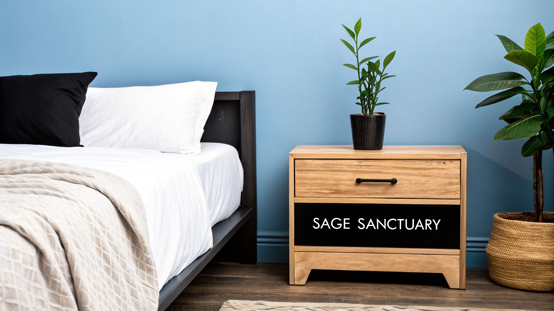
This versatile shade works beautifully in luxury interiors, providing a soft backdrop that enhances rather than overwhelms. It’s the perfect choice for creating a restful retreat that feels connected to the natural world.
Key Insight: Sage green’s grey undertones give it a chameleon-like quality, allowing it to adapt to various lighting conditions and complementary colour palettes, from warm neutrals to deep charcoals.
How to Implement Sage Green
- Select the Right Shade: For a proven high-end look, consider shades like Farrow & Ball's Vert de Terre or Benjamin Moore's Saybrook Sage, often featured in luxury residential projects and upscale retail collections.
- Create Contrast: Pair sage walls with crisp white trim and ceilings. This classic combination makes the green feel fresh and intentional, preventing it from looking dull.
- Incorporate Texture: Elevate the look with natural materials. Think Belgian linen bedding, jute or wool rugs, and light-toned wood furniture. This layering of textures adds depth and warmth. Complementing the colour scheme with houseplants can further enhance this natural aesthetic; find out more about the best plants for your bedroom.
- Test in Your Space: Always test paint samples on your walls. Observe how the colour changes with natural and artificial light throughout the day and evening before committing.
2. Warm Gray
Warm gray, often referred to as "greige," is a sophisticated neutral that blends the modern coolness of gray with soft, inviting warm undertones. This colour has become a cornerstone of luxury interior design, offering a versatile backdrop that feels both contemporary and cosy. Popularised by brands like Restoration Hardware and featured heavily in HGTV design shows, warm gray provides an elevated, calming atmosphere perfect for a restful bedroom.
It serves as an ideal canvas, allowing for a wide range of decorating styles without overpowering the space. This makes it one of the most enduring bedroom paint colour ideas for creating a serene and polished retreat.
Key Insight: Warm gray’s strength lies in its balance. It avoids the starkness of cool grays and the potential over-saturation of beiges, creating a perfectly poised neutral that enhances architectural details and high-end finishes.
How to Implement Warm Gray
- Select the Right Shade: For a proven, high-end aesthetic, look to iconic shades like Benjamin Moore’s Revere Pewter, a favourite in luxury residential projects, or Sherwin-Williams' Accessible Beige, often used in boutique hotels for its welcoming feel.
- Incorporate Texture: Prevent a warm gray room from feeling flat by layering various textures. Think plush velvet cushions, chunky knit throws, rich wooden furniture, and high-quality linen bedding. Find more visual inspiration for creating a textured bedroom.
- Use Warm Lighting: Enhance the cozy undertones by using warm-toned light bulbs (around 2700K). This will bring out the colour's inherent warmth, especially in the evening, making the room feel like a comfortable haven.
- Test in Your Space: Always paint large swatches on multiple walls to see how the colour interacts with your room's specific natural and artificial light. A warm gray can appear more gray or more beige depending on the lighting conditions.
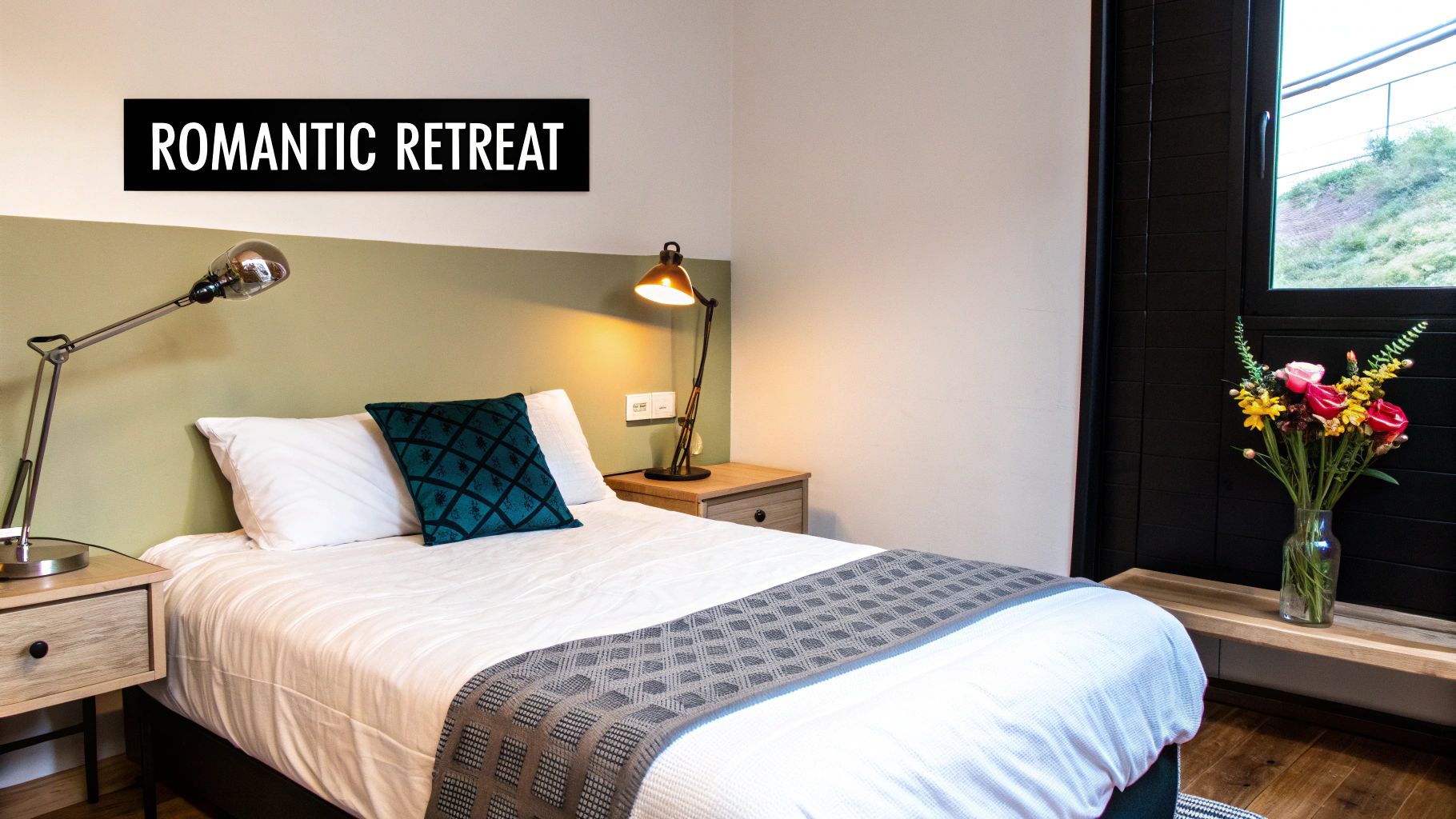
3. Soft Blue
Soft blue is a gentle, soothing colour that evokes feelings of tranquillity and peace, reminiscent of clear skies and calm waters. It's one of the most classic bedroom paint colour ideas because of its proven ability to lower the heart rate and promote restful sleep. This calming effect makes it a perennial favourite in high-end residential projects and coastal resorts, popularised by the Scandinavian design movement and publications like Coastal Living.
This colour creates an airy, light-filled atmosphere that feels both expansive and comforting. Its inherent serenity makes it ideal for crafting a peaceful escape from the demands of modern life, ensuring your bedroom is a true sanctuary.
Key Insight: Soft blues with subtle grey or green undertones appear more sophisticated and timeless than their primary counterparts, preventing the space from feeling like a child's room.
How to Implement Soft Blue
- Select the Right Shade: For a refined and elegant finish, look to designer-approved shades. Farrow & Ball's Borrowed Light offers an ethereal quality, while Benjamin Moore's Healing Aloe is renowned for its use in creating calm environments.
- Create Balance with Warmth: To prevent a soft blue room from feeling too cool, introduce warm accents. Brass or gold hardware, light oak furniture, and leather details provide beautiful, grounding contrast.
- Keep Bedding Bright: Pair soft blue walls with crisp white or cream linen bedding. This combination enhances the room's airy feel and creates a clean, hotel-like aesthetic that feels fresh and inviting.
- Consider an Accent Wall: If painting all four walls feels too overwhelming, a soft blue accent wall behind the bed can provide the same calming effect without dominating the space.
4. Dusty Rose
Dusty rose is a muted, sophisticated pink with grey undertones that creates a romantic yet modern bedroom atmosphere. A grown-up evolution of the Millennial Pink trend, this colour offers warmth and femininity without appearing overly sweet or childish, making it an excellent bedroom paint colour idea for a chic, tranquil space. Popularised by contemporary paint companies like Clare and featured by lifestyle bloggers, dusty rose has secured its place in high-end design for its understated elegance.
This versatile hue envelops a room in a soft, welcoming glow, perfect for crafting a serene and stylish personal sanctuary. It provides a warm, nurturing backdrop that feels both contemporary and comforting.
Key Insight: The success of dusty rose lies in its grey undertones, which mute the pink's sweetness and lend it a sophisticated, earthy quality. This allows it to function almost as a neutral, pairing beautifully with a wide range of materials and colours.
How to Implement Dusty Rose
- Select the Right Shade: For a refined and modern aesthetic, consider shades such as Benjamin Moore's Organdy or Sherwin-Williams' Intimate White. These have proven successful in luxury bedroom makeovers and boutique hotel suites.
- Balance with Neutrals: Pair dusty rose walls with crisp white trim, ceilings, and bedding. This contrast keeps the look fresh and prevents the pink from feeling overwhelming, creating a clean, polished finish.
- Incorporate Rich Textures: Elevate the colour by layering it with natural textures. Think Belgian linen bedding, jute rugs, and accents of light wood or marble. These materials add depth and prevent the space from looking flat.
- Add Metallic Accents: Introduce metallic elements in brushed gold, brass, or rose gold through light fixtures, hardware, or mirror frames. These warm metals complement the pink's warmth and add a touch of glamour.
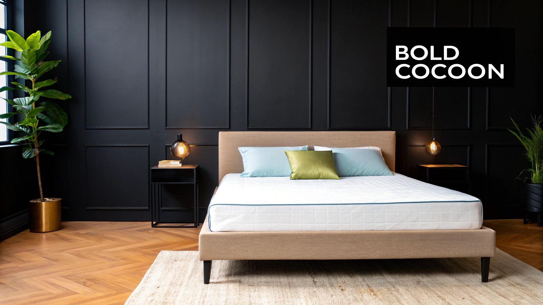
5. Charcoal Gray
Charcoal gray is a deep, dramatic gray that creates a sophisticated and cozy bedroom environment. This bold neutral is one of the more daring bedroom paint colour ideas, providing excellent contrast for artwork and bedding while maintaining a calming, cocoon-like atmosphere. Popularised by luxury hotel chains like Edition and 1 Hotels, as well as the modern farmhouse trend, charcoal gray delivers an enveloping sense of intimacy and high-end style.
This powerful shade is ideal for crafting a moody, hotel-inspired retreat. Its depth makes a statement, turning the bedroom into a sophisticated haven that feels both protective and supremely elegant, perfect for unwinding after a long day.
Key Insight: Unlike lighter grays, charcoal possesses rich undertones (often brown, blue, or violet) that give it incredible depth. This complexity allows it to feel warm and inviting rather than cold or stark, especially in a well-lit space.
How to Implement Charcoal Gray
- Select the Right Shade: For a proven, high-end aesthetic, look to iconic shades like Sherwin-Williams' Iron Ore, often used in luxury hotels, or Farrow & Ball's celebrated Downpipe, a favourite in upscale residential projects.
- Embrace Strategic Lighting: A dark colour requires a thoughtful lighting plan. Incorporate multiple sources, such as bedside table lamps, floor lamps, and wall sconces, to create pools of warm light that prevent the space from feeling cavernous.
- Balance with Light Elements: Contrast is crucial. Pair charcoal walls with light-coloured bedding in shades of crisp white, soft cream, or natural linen. Light-toned wood furniture and bright white trim will also lift the room and create a sharp, defined look.
- Use Mirrors and Metallics: Add mirrors to reflect light and create an illusion of greater depth. Metallic accents in brass, gold, or chrome will catch the light beautifully against the dark backdrop, adding a touch of glamour.
- Test an Accent Wall: If you're hesitant to commit to four dark walls, start with an accent wall behind the bed. This provides the same dramatic focal point without overwhelming the entire space, making it a great entry point to using bold bedroom paint colour ideas.
6. Creamy White
Creamy white is a warm, soft white with subtle yellow or beige undertones that creates a clean, serene bedroom environment. This classic and versatile option is one of the most enduring bedroom paint colour ideas because it provides a fresh, airy feel while maintaining essential warmth and cosiness. Popularised by the Scandinavian design movement and modern farmhouse aesthetics, creamy white offers a sophisticated alternative to stark, clinical whites.
This shade serves as a luminous canvas, making it ideal for luxury interiors where cleanliness and tranquillity are paramount. It allows architectural details and curated decor to stand out, creating an atmosphere that feels both expansive and inviting, perfect for a peaceful bedroom retreat.
Key Insight: The success of a creamy white room lies in layering. Without sufficient texture and variation, warm whites can fall flat. Integrating different materials prevents the space from feeling one-dimensional.
How to Implement Creamy White
- Select the Right Shade: For a proven high-end look, consider shades like Benjamin Moore's Cloud White, a favourite in luxury residential projects, or Farrow & Ball's Pointing, often used in boutique hotels for its soft, traditional character.
- Layer Tonal Textures: To add depth and prevent monotony, layer various textures in similar shades. Think Belgian linen bedding, chunky knit throws, bouclé armchairs, and a high-pile wool rug. This creates a rich, tactile experience.
- Inject Personality: Use creamy white walls as a gallery-like backdrop for colourful artwork, statement lighting, or bold accessories. These elements will pop against the neutral base, adding personality without overwhelming the calm aesthetic.
- Test in Your Space: The undertones in white paints are highly reactive to light. Always test samples on your walls, observing how the colour appears in the morning sun, on a cloudy afternoon, and under artificial lighting to ensure it reads as intended.
7. Lavender
Lavender is a soft, dreamy purple hue that introduces a sense of tranquillity and subtle elegance to a bedroom. This gentle colour is often associated with aromatherapy and peacefulness, making it one of the most effective bedroom paint colour ideas for creating a restful, restorative sanctuary. Inspired by the French Provincial aesthetic and embraced by the wellness industry, lavender creates a soothing atmosphere that encourages relaxation and sleep.
This sophisticated shade is perfect for those looking to design a space that feels both chic and calming. Its delicate nature provides a serene backdrop that supports deep rest without feeling overly sentimental, fitting seamlessly into high-end, thoughtful interior designs.
Key Insight: Unlike bolder purples, soft lavender has grey or blue undertones that give it a muted, grown-up quality. This allows it to function as a neutral, pairing beautifully with a wide range of materials and colours from cool greys to warm, natural woods.
How to Implement Lavender
- Select the Right Shade: For a refined and contemporary feel, look to shades like Farrow & Ball’s Brassica, which offers a complex, muted tone seen in luxury residential projects. Benjamin Moore’s Lavender Mist provides a lighter, more ethereal quality perfect for a spa-inspired retreat.
- Balance with Neutrals: Pair lavender walls with crisp white trim, ceilings, and bedding. This contrast keeps the look fresh and prevents the soft purple from appearing dated, ensuring a clean and modern aesthetic.
- Ground with Natural Elements: Incorporate natural textures to prevent the space from feeling too whimsical. Light oak or walnut furniture, woven baskets, and linen curtains add warmth and an earthy balance to lavender’s dreamy quality. To explore more ways to integrate these elements, discover these bedroom design ideas.
- Consider an Accent Wall: If you're hesitant to paint the entire room, a lavender accent wall behind the bed can create a stunning focal point. This approach adds a peaceful pop of colour without overwhelming the space, defining the sleep zone with intention.
8. Terracotta
Terracotta is a warm, earthy orange-red that infuses a bedroom with natural warmth and a sense of grounding. This rich colour, reminiscent of sun-baked clay, desert landscapes, and Mediterranean villas, creates an inviting and cosy atmosphere. Its popularity surged with design trends embracing organic textures and earthy palettes, notably highlighted when Sherwin-Williams named Cavern Clay their 2019 Colour of the Year.
This sophisticated hue is one of the most compelling bedroom paint colour ideas for those wanting to create a space that feels both worldly and comforting. Terracotta connects us to artisanal traditions and the natural world, making it an excellent choice for a luxurious, yet unpretentious, bedroom retreat.
Key Insight: The power of terracotta lies in its ability to be both stimulating and soothing. Its reddish-brown base provides energy and warmth, while its earthy quality keeps it grounded and calming, avoiding the overstimulation of a true red or orange.
How to Implement Terracotta
- Create a Focal Point: Terracotta works exceptionally well as an accent wall, particularly behind the bed. This provides a bold statement without overwhelming the space. In a larger room, painting all four walls in a muted terracotta can create a cocoon-like effect.
- Balance with Neutrals: Pair terracotta walls with crisp whites, soft creams, or light greys. This contrast prevents the colour from feeling too heavy and adds a modern, fresh feel to the space. Think white linen bedding and off-white trim.
- Layer with Natural Materials: Enhance terracotta's earthy vibe by incorporating natural textures. Light-toned wood furniture, rattan or wicker accents, jute rugs, and plenty of houseplants create a harmonious and balanced aesthetic that feels rooted in nature.
- Select the Right Tone: For a bold, authentic look, consider Sherwin-Williams' Cavern Clay. For a softer, more muted approach, a shade like Benjamin Moore's Sedona Clay offers warmth with a gentler presence, perfect for a serene bedroom.
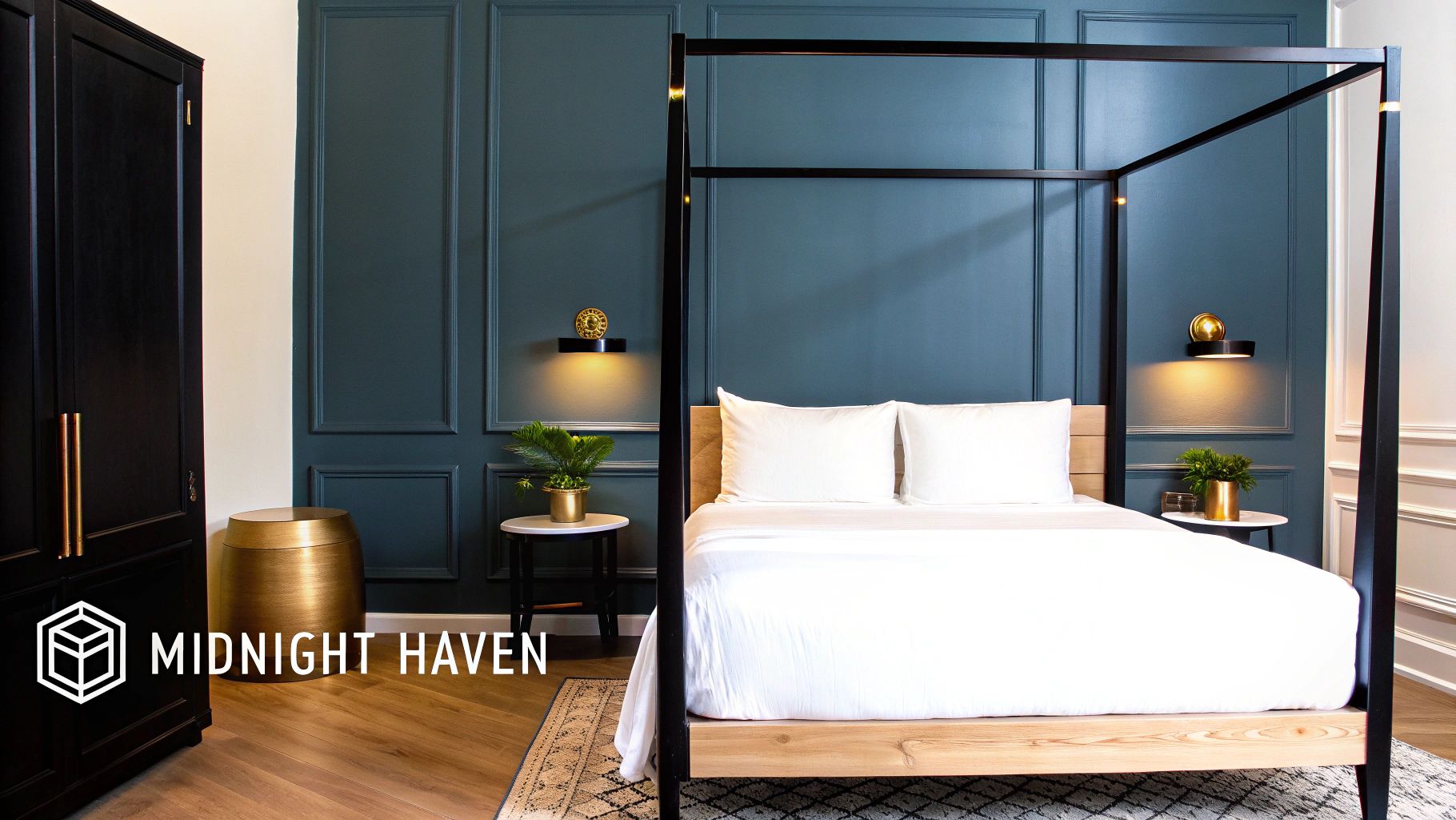
9. Navy Blue
Navy blue is a deep, rich colour that creates a sophisticated and dramatic bedroom environment. This timeless hue provides excellent contrast while fostering a calming, cocoon-like atmosphere that is wonderfully conducive to rest and relaxation. Seen everywhere from classic American design to luxury hotel suites, navy is a confident and established choice among bedroom paint colour ideas for those seeking a bold yet serene space.
This classic colour works perfectly in high-end interiors, wrapping the room in a sense of comforting depth. It is an excellent choice for crafting a distinguished and moody retreat that feels both grand and intimate.
Key Insight: Navy blue's depth makes it a brilliant backdrop for showcasing art, metallic finishes, and high-contrast neutrals. It makes white elements appear brighter and metallic accents richer.
How to Implement Navy Blue
- Select the Right Shade: For a proven high-end look, consider iconic shades like Benjamin Moore’s Hale Navy for a traditional feel, Sherwin-Williams’ Naval for a touch of modern drama, or Farrow & Ball's Stiffkey Blue for a complex, inky finish.
- Create Sharp Contrast: Pair navy walls with crisp white trim, ceilings, and bedding. This classic combination is essential to prevent the deep colour from feeling overwhelming and ensures the space remains bright and balanced.
- Incorporate Warm Accents: Elevate the look by introducing brass or gold accents through lighting fixtures, picture frames, and hardware. These warm metals pop beautifully against the cool blue, adding a layer of luxury and warmth.
- Layer Your Lighting: A dark colour absorbs light, so ensure the room has multiple light sources. Supplement overhead lighting with bedside table lamps and floor lamps to create a well-lit, inviting ambience in the evening.
Bedroom Paint Colors Comparison Chart
| Color | Implementation Complexity 🔄 | Resource Requirements 💡 | Expected Outcomes 📊 | Ideal Use Cases 💡 | Key Advantages ⭐ |
|---|---|---|---|---|---|
| Sage Green | Moderate - requires lighting and undertone testing | Moderate - paint samples, natural materials | Calming, serene, timeless sanctuary | Bedrooms needing relaxation and versatility | Promotes sleep, pairs with warm/cool accents |
| Warm Gray | Moderate - undertone coordination needed | Moderate - texture layering, warm lighting | Sophisticated, spacious, hotel-like atmosphere | Versatile decor styles and small rooms | Extremely versatile, enlarges room visually |
| Soft Blue | Moderate - shade selection and warm accents needed | Moderate - accent materials (wood, brass) | Spa-like calm, lowers heart rate | All ages, gender-neutral serene bedrooms | Scientifically proven for better sleep |
| Dusty Rose | Moderate - balance required to avoid overly feminine | Moderate - metallic and natural texture accents | Romantic, intimate, modern bedroom | Romantic and sophisticated spaces | Warmth without overly sweet pink |
| Charcoal Gray | High - requires multiple light sources | Higher - lighting fixtures, mirrors | Dramatic, cozy, luxury hotel-style atmosphere | Intimate, sophisticated, art-focused spaces | Makes artwork pop, hides imperfections |
| Creamy White | Low - straightforward but lighting sensitive | Low - versatile with minimal styling | Spacious, clean, airy, cozy atmosphere | Any decor style needing brightness | Timeless, makes rooms larger |
| Lavender | Moderate - balance to avoid overwhelming | Moderate - natural elements for grounding | Relaxing, dreamy, unique alternative to neutrals | Spa-inspired and romantic bedrooms | Promotes relaxation and better sleep |
| Terracotta | Moderate - best as accent, requires careful styling | Moderate - natural textures and plants | Warm, inviting, grounding atmosphere | Cozy, rustic, Mediterranean-inspired spaces | Adds warmth, complements natural materials |
| Navy Blue | High - lighting and contrast balancing important | Higher - multiple light sources, metallic accents | Sophisticated, dramatic, calming cocoon-like feel | Traditional and modern luxury bedrooms | Timeless, makes accents pop |
Bringing Your Vision to Life with Colour and Texture
Selecting the perfect hue for your sanctuary is a deeply personal journey, but as we've explored, it's a foundational step in crafting a truly luxurious space. The power of a well-chosen colour palette cannot be overstated. From the organic tranquility of Sage Green to the sophisticated depth of Navy Blue, each shade offers a unique canvas upon which to build your dream bedroom. Our exploration of these diverse and elegant bedroom paint colour ideas has shown that the right choice can profoundly influence mood, perception of space, and overall comfort.
Remember that the colours we've discussed, such as the nurturing warmth of Terracotta or the understated chic of Warm Grey, are more than just trends. They represent distinct atmospheric qualities. Your final decision should resonate with the feeling you wish to cultivate, whether it's the peaceful repose offered by Soft Blue and Lavender or the dramatic, enveloping comfort of Charcoal Grey. The goal is to create a backdrop that not only looks stunning but also supports your well-being.
From Paint Swatch to Sensory Experience
The true art of interior design, however, lies in moving beyond the paint tin. A colour's potential is only fully realised when it is layered with complementary textures, materials, and lighting. This is the key to transforming a beautifully painted room into an immersive, sensory haven.
Key Takeaway: A successful bedroom design is a holistic one. The visual appeal of your chosen paint colour must be enhanced by tactile elements that invite touch and add depth, creating a space that feels as good as it looks.
Consider these actionable next steps to complete your vision:
- Pair Cool Tones with Warm Textures: For colours like Soft Blue or Warm Grey, introduce warmth through natural fibres. Think chunky knit wool throws, plush velvet cushions, or the soft, breathable touch of high-quality linen bedding.
- Enhance Warm Tones with Natural Elements: Shades like Terracotta and Dusty Rose come alive alongside timber furniture, woven rattan accessories, and handcrafted ceramics. These organic materials ground the space and amplify its earthy, inviting nature.
- Balance Dark Walls with Light and Sheen: A bold choice like Charcoal Grey or Navy Blue can feel incredibly cosy rather than cavernous when balanced. Use lustrous silks, metallic accents in brass or bronze, and strategically placed mirrors to reflect light and add a layer of sophisticated glamour.
Ultimately, mastering these concepts allows you to curate a bedroom that is an authentic reflection of your personal style. It’s about creating an environment that is not just aesthetically pleasing but also serves as a genuine retreat from the outside world. By thoughtfully combining these bedroom paint colour ideas with considered textures and decor, you are investing in a space that will feel restorative, inspiring, and uniquely yours for years to come.
Ready to find the perfect textiles to complement your new colour scheme? The luxurious, airo-washed linen bedding from The Foxes Den provides the ideal texture and softness to complete your sanctuary. Explore our curated collection at The Foxes Den and discover the final layer for your beautifully designed bedroom.